Thursday, August 31, 2006

DSPR12B - PRINT FUNDAMENTALS - TASK 2 : CUVDES01A


This task requires that we research three resources on Colour Theory. Two have been chosen from the Ithaca TAFE Library (1 x Book + 1 x Magazine) and one from the web.

Magazine: Computer Arts Projects - July 2006

This issue is dedicated to Print design and colour usage . It includes informative and practical advice from the experts on successful colours and finishes for specific target audiences and for specific project concepts. This magazine also provides the reader with a free CMYK colour chart and a creative tutorials booklet with 40 pages of tuts and fantastic ideas and inspirational images to help the budding Graphic Designer.

Book: Mix & Max Designers Colours by David Bann

This book is a Designers handbook of colour swatches for choosing and specifying tints for use in the 4-colour print process. The 600 swatches display the percentage breakdown for each and can be easily compared with the other colours and their tint properties. These colours were selected to best represent a broad range of usage for all forms of print media. All colours in this informative and practical book were produced using process colour tints and are compatible with the 4 colour print process. This book delivers a short but comprehensive section on colour theory, specifically on the relationship beween Subtractive and Additive colours and their application from screen to print on various types of paper.


Website: Colour Matters: http://www.colormatters.com/colortheory.html

This site covers the definitions and concepts and design applications in regards to colour theory. The basic concepts of colour are introduced using a colour wheel in full and then split into Primary, Secondary and Tertiary, Analogous and Complimentary as shown in the below figures. Colour is described in a more traditional sense as these colours originally represented pigments. However we now have many variations of the Colour Wheel given the advancements in computer and print technology. Colour Matters also looks athe psychology of colour in terms of Harmony a balance in the visual experience for the viewer of the design.

COLOUR WHEEL, PRIMARY, SECONDARY & TERTIARY COLOUR WHEELS.

COOL QUOTE: "... extreme unity leads to under-stimulation, extreme complexity leads to over-stimulation. Harmony is a dynamic equilibrium."

http://www.colormatters.com/colortheory.html


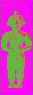
SET OF STATUES - BY KYLEIGH SHARPE

Sunday, August 20, 2006

DSPR12B - PRINT FUNDAMENTALS : 2D & 3D Typography Class Task.

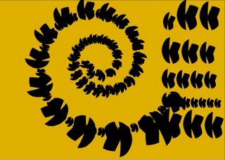
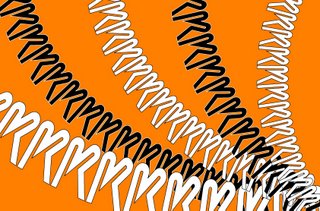
This task required that the class place our chosen initial on our page in either a 2D or 3D format using set tools in Adobe Illustrator. We were restricted to using only 2 colours for the font and our page could be any colour. In addition we were allowed to use the tools from the tool menu combined with several palette options:


Friday, August 18, 2006

CUVCOR09A - PRINT FUNDAMENTALS 3: Create a Bicycle Task - Section 2 (1a)

For this task we are asked by our Teacher to:

Construct a simple side-view of a Bicycle. You may use the Polar Gri
d Tool for the wheels.


I am using the above images for inspiration for this task as well as my childhood memories of massive bike stacks and evil kenevilism! I had 2 cool bikes while growing up on Nth Stradbroke Island at Dunwich & Myora. A Mongoose BMX which I caned over burms and a Purple & Orange Malvern Star Dragster (Chopper) for cruising round to mates' places & getting up to lots of mischief. I always had to double someone either on the handle bars, or when I got pegs, on the back holding on for dear life as we took off out to Point Lookout to go surfing. I have had heaps of stacks and many scars to prove it. We also had a crazy sport we called Jetty-Jumpin' - a rope tied to your ankle and then connected to the seat post. Peddle as fast as you can right to the end of the jetty gettting as much AIR as possible and Yehah!!! It was a little painful at times landing incorrectly but it was the thrill of trying to jump the highest and the furtherest and living to boast about it, that kept us dedicated to our death-defying feats. Sharks were spotted on one particular day circling the jetty at Dunwich - so consequently no more jetty-jumpin'for me! I actually haven't been on a bike in ages - apart from the excercise bike that sits in the entertainment area collecting dust!
This is an image of the Dunwich Jetty on a very misty cold day.


So this is what I came up with - very basic bike but with practise I hope to improve!


Thursday, August 17, 2006

CUVDSP01A - PRINT FUNDAMENTALS 3: TASK 1


For this task I will post my research findings on 4 Companies that interest me. I will list their Structure, Clients, and the Type of Design Work they are known for using illustrations from their folios.


NEOSTREAM are a Multimedia Company established in 1998 in Australia. Neostream are one of the leading creative teams in all facets of design for thhe web. Their projects are many and varied and offer a number of development services as:
  • Creative Visual Design
  • User Interface/Navigation Design
  • Web based Multimedia
  • WebApplication Development
  • Database Design & Development
  • Content Management System
  • Back Ofice Administration
  • e-CRM
  • e-Shopping System.
The Neostream website is a fully interactive Flash Animated site that speaks for itself. These designers are highly skilled and their client base is filled with leading Big Businesses such as:

http://neostream.com/

Design Funktion is Peter Nizic - Graphic Designer.
His areas of interest work are:
  • Illustration
  • Music
  • Film
  • Photography
  • Typography
  • Animation
  • Web
Peter Nizic specialises in website overhauls using fresh design concepts for cutting edge Corporate Documents, Logos, Magazines, Stationery & Fashion. His Portfolio showcases his versatility and his website also displays his ability to create some interesting and functional design concepts.

COOL LINKS: http://www.puddleducks.com.au/
http://www.londonducktours.co.uk/


http://www.designfunktion.net

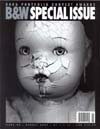
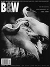
Black & White Magazine are a Fine Photography Magazine that specialise in Advertising & Marketing & showcase a plethora of Photographic artists using layout and visual mechanisms for best results in print media. They feature an "Exposure Section - Show Your Work" for budding photographers and Graphic Designers who are looking for an opportunity to have their work seen & critiqued by curators & galleries. Competitons are held annually for the best Photo and contestants can choose from the following categories:
1 - Animals
2 - Landscape / Nature
3 - Digital Conceptualization
4 - Nude / Body
5 - Advertising / Fashion
6 - Still Life / Objects
7 - Architecture / Interiors
8 - Photojournalism / Documentary
9 - Music / Sports / Dance

10 - Seascape / Water

11 - Flower / Plants / Fruits

12 - Portraiture / Children

13 - Travel / People / Places

14 - Cityscape / Street

15 - Metaphor / Abstract

16 - Pattern / Texture


http://www.bandwmag.com/

Pandamonium
Design are digital communication experts with excellent design solutions for all mutimedia projects. They have created many unique concepts for a wide variety of markets and have the ability to hone in on the branding needs of their clients. They are a broad spectrum group that have created fun & clever design for the everchanging projects they undertake.

KILLINGTON
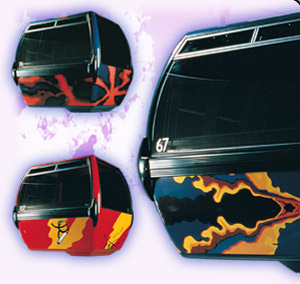
Skyeships & K1 Projects

Collaborating with Sirge Creative Alliance, more than 40 original designs were created for over 100, state-of-the-art ski gondolas by Pandamonium Design.


SONY ENTERTAINMENT
Wild Thing Watch

Sony relies on Pandamonium Design for their expertise in assisting with the design & production of their theme merchandise.


GOAL LINE HOCKEY
Brand Identity

Pandamonium created a complete development of Goal Line’s symbol, identity system, and retail collateral.


http://www.pandamonium.com